2014 Pantone Palettes
Introducing the 2014 Pantone color palettes at the International Home + Housewares Show, Leatrice Eiseman, Pantone Color Institute’s Executive Director, explained that although there are a lot of new trends in the 2014 Pantone palettes, there are also some familiar themes recurring. For example, consumers have an attachment to the “preppy” type of vintage style that can often be seen in top-end boutiques and retail stores – a bit of old meets new.
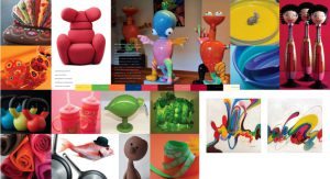
 Techno Color
The advancement of technology is guiding this group – expanding the color universe typically associated with tech products and the vibrancy and deep hues that take well to reflective surfaces. The star of the year, Emerald, makes itself known here, alongside a turquoise-like blue, a daring orange, an equally as strong purple and a true blue. Jet-black and citron also make a riveting appearance, taking the techno family together to a whole new level of modernity.
Physicality
Power and energy come together in a ‘fit’ expression that is unexpected. Today, physicality is not all about fluorescent hues and eye-popping tones, but rather, takes a bow to colors that incite introspection and a sense of calm. Forged Iron, Satellite Gray, Antique Moss and Gothic Olive are woven into a holistic tapestry of healing shades that encourage quiet awakenings. Think herbal lavender and grayed grape, playing quietly with a rosy brown and mystic foggy gray.
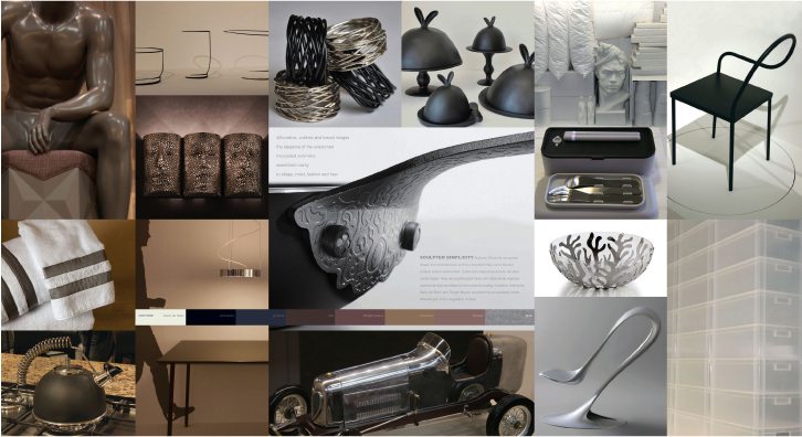 Sculpted Simplicity
A designer product’s dream, this collection of colors recognizes form and structure, and how crucial they are to products and the world around us. Excuse Pantone for saying so, but sometimes color does not have to hog the limelight but instead give the form of a product that subtle lift it needs to say hello. Sophisticated tones with distinct, strong character can enhance the shape and very meaning of sculpted products. Travertine, Anthracite, Blanc de Blanc and Twilight Mauve, backed up by Anondized Brown, Ethereal Gray and a sliver of silver. What more can a great designer product ask for?
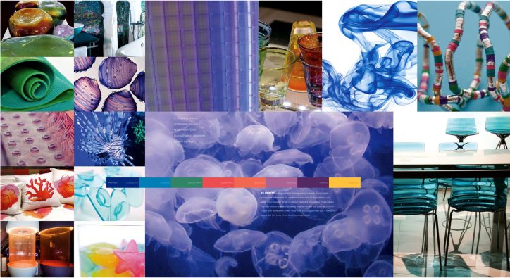
Fluidity
The cool, invigorating shades of water underpin this collection, but it’s also about the vibrancy of life pulsating beneath the ocean’s surface. Dazzling blues and blue- greens gracefully overarch the hues that can be found in coral and other sealife: shimmering seagrass shades alongside Absinthe Green, Violet Tulle, blazing Samoan Sun, Dewberry Purple and two tones of intoxicating oranges inspired by coral.
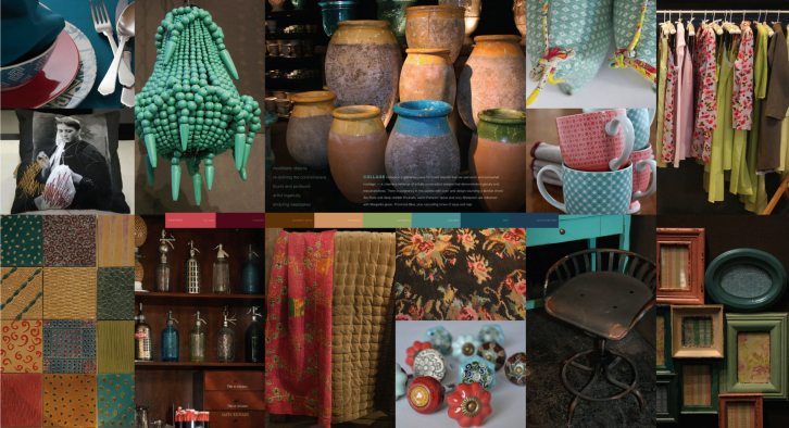
 Collage
Nostalgia is key in this collection and while some of these combinations have been seen before, retailers should always remember that a sense of newness comes from the way colors, even if used and well- loved, are harmonized. There is nostalgia and poignancy in this palette – art and history merge in an orchestral alignment of things that came before us: Tea Rose and deep Rhubarb. A warm Pumpkin Spice with a cozy Sheepskin. They are all lifted with a Margarita Green, Provincial Blue and understated, yet never to be under-rated, tones of aqua and teal.
Intimacy
“Here, one color seems to glide into the next,” says Eiseman. An affinity of
tints and tones in this collection create a softly tactile, intimate marriage of warm colors and neutral tones. It proves that a beige approach, or being understated, does not always mean boring. Class meets sophistication with Gardenia whites and lotus blossom pink. Rose Cloud, Fawn and Café Crème spell a romantic wedding in a daydream, while Lavenders and Opal Gray are like long-lost friends, rising from the memories of a Jane Eyre novel.
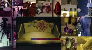
 Moda
Moda
Tamara de Lempicka meets a modern day explosion of fashion, sexiness, theatre and all the drama and excitement of the high life. Racy Red Dahlia can easily have an exciting affair with Blackberry Cordial and Wood Violet, joined at any unexpected time by Amber Green. Corsican Blue and Magenta Haze are a scandalous riot, while Linden Green can make any room come alive. And then there is classic Rich Gold – add it to any of the parties for an effect that will bring the house down.
Tribal Threads
The complexity of culture, religion and politics meets the soulful simplicity of community and life, in its barest form. The threads of tribal diversity in this collection means that whomever a retailer is trying to reach, there are combinations that speak of a world connected and cultures with their own strong spirit. Neutral tones of Bleached Sand and Kangaroo Brown highlight an Arabesque burnt orange, while Goblin Blue makes an appearance alongside Curry and Peppercorn. A rose-dusted cedar shade brings everything down to earth, next to a calming, enticing taupe-toned Incense.
 Eccentricities
Sometimes you need to go crazy and embark on an adventure. A kid’s section, or a selection of products with humor, need to have an eccentric twist and sometimes an almighty lift. Take tongue-in-cheek to the next level and be brave with juxtaposition. Team Neon Green with a zesty lemon or nectarine with a daredevil Skydiver Blue. Fudgesickle Brown can bring out the sweetness of Strawberry Ice. A warm red in this collection comes together beautifully with its cooler counterpart, and don’t forget black and white – they can really make this collection of evocative colors truly dance.
Extracted with permission from PANTONEVIEW home + interiors 2014.
To learn more about 2014 Pantone palettes, see www.pantone.com.