Color/Design at a Crossroads: Finding the Most Directional Trends
With the consumer’s constant desire to see something new continuing to influence color/design trends, the question becomes what path will best drive success and consumer or client satisfaction? As color choices are so closely tied to personal expression, the answer is in developing the ability to better assess and gauge client aspirations and lifestyle needs so that you can guide and encourage the use of invigorated color and design palette that will persuade, engage, enlist and enable new directions.
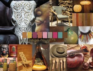 Native Instincts
At one point in time, the term “native” applied to a specific indigenous culture. However, style-wise, current and future forecasts point to a homogenous mix of design and color where a piece of Native American pottery is quite compatible with a Turkish kilim carpet and/or a pre-Columbian artifact.
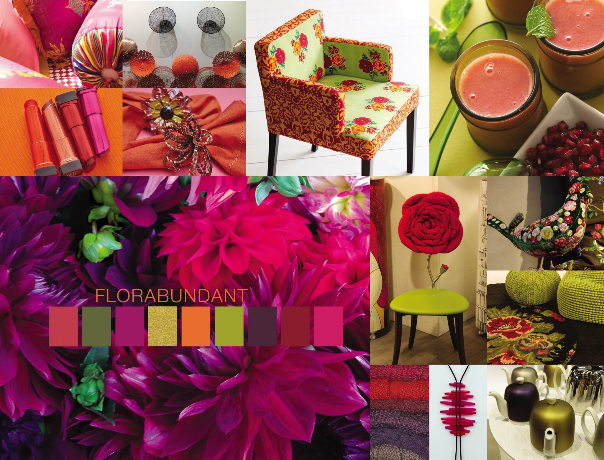
 Florabundant
Just as its name implies, Florabundant is filled with the sumptuous beauty of rich floral hues. It is an enticing, lavish and profuse palette and, mirroring the poetic names of the floral colors, there is an unmistakable drama in the variety of shades. As in most floral arrangements, as well as in natural settings, varying shades of green provide the perfect complementary and ubiquitous background to the more vibrant tones in the design palette.
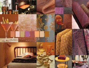 Acquired Taste
In both food and surroundings, an acquired taste means an appreciation for the unusual, the unique or the distinctively different. In terms of color, this means a mix of colors and/or textures that are not commonly seen together, yet they create a design palette that is subtly luxurious.
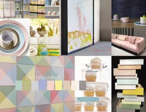
Day Dreaming
In the harried and demanding world in which we live, the palette titled Day Dreaming offers a welcome respite and can truly fulfill its literal meaning as a “series of pleasant thoughts that distract our attention from the present.” The colors that evoke those thoughts are often light and seemingly weightless, as if to relieve the heaviness of day-to-day stresses.
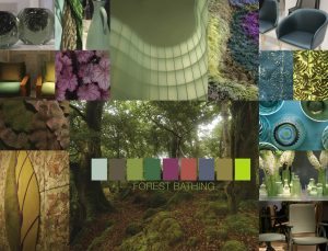 Forest Bathing
Encouraging a healthy lifestyle is a stress-reducing design palette inspired by the Japanese practice of “Shinrin-yoku” or “Forest Bathing.” Studies have shown that a contemplative walk in the woods that reconnects the individual with nature or, at the very least, surrounding oneself with greenery, is relaxing and restorative, elevating our mood.
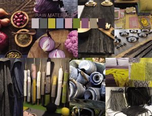
Raw Materials
Raw Materials is a selection of colors that reflects and symbolizes several disparate movements in color, design and lifestyle that come together to make for some highly creative and unique color mixes. The ongoing dedication to the re-use and re-purposing of materials from nature and industrial resources plays an outsize role, as does the wellness and health movement, which continues to highlight nutritious foods displayed in disarmingly appetizing and artistic ways.
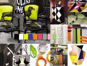 Graphic Imprints
The Graphic Imprints palette starts, just as line drawings do, in black and white, often shaded with gray. The use of those basic hues defines the simplicity and strength that has made them classic and never go out of style. Contours, geometric shapes and texture can add interest and dimension. However, it is the use of vivid color whether as a strong single color story or displayed in patchwork-like composition that adds the greatest impact to this basic color pairing.
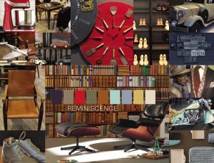 Reminiscence
Reminiscence represents a different kind of walk, this time down memory lane as the concept of repeated history continues to engage across generations. Providing a sense of nostalgia and stability in this age of rapid-fire digital innovations, a color palette highlighting more traditional shades creates a sense of comfort in its link to the past.
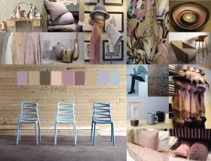 At Ease
Blending tonalities that invite harmony and composure into any given space, At Ease is a palette that is the essence of subtlety. A variety of ever-popular neutrals, both cool and warm, blended with muted tones, the colors are adroitly arranged so that they seem effortless. Combinations are equally effortless as their undertones are simpatico.
The audio recording of the presentation is available at http://www.housewares.org/education/presentations-webinars.
Extracted with permission from PANTONE®VIEW home + interiors 2017 trend forecast.
To learn more about Pantone, see www.pantone.com.