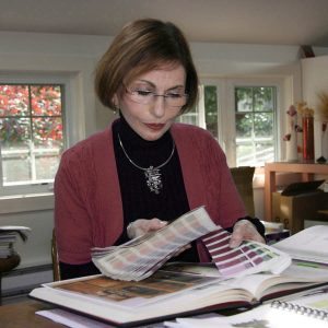
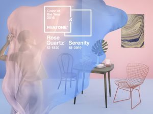
 For anyone involved in retail or a creative industry, or simply anyone with a love of color, Pantone and Leatrice (Lee) Eiseman need no introduction. The author of nine books on color, a color consultant to industry and a regular speaker around the globe at retail trade shows, as well as the originator of color training programs held twice a year, Eiseman has been inspiring others with color for more than three decades. Every year, when the Pantone Color of the Year is released alongside its range of complementary subsets, Eiseman begins a fresh journey guided by colors and inspiration gleaned from her life, surrounds, experience and travels.
“Our goal is always to inspire people by starting a conversation about color,” she explains. “That is our ultimate goal in creating the Pantone Color of the Year—to get people talking about color and opening themselves to using color in more thoughtful, interesting ways. From a pragmatic business standpoint, once you get people to pay more attention to color, this will ultimately lead to greater attention in the marketplace. Inevitably, especially for creative industry and retailers, this will lead to more sales.
 “It’s astounding to us to see some of the applications we might not have expected when the color of the year is released. It is certainly expected in beauty, fashion and many aspects of the home, but we also see applications in everything from high-tech products to small appliances,” she explains. “And to see the colors in the more mundane products such as a steering wheel cover is always such fun! The housewares industry always makes great use of the color of the year, ranging from beautiful high-end glassware, tabletop and ceramics to plastics and a multitude of other fabrications.”
On a personal level, Eiseman admits that she is quite open-minded when it comes to inspiration, and that’s no surprise, considering how the industries she works in and with are in continual stages of rapid change, and that she is often travelling. One week she might be in Korea delivering a color trend seminar and the next in New York City discussing brand image or the psychology of color, or in London for a color forecasting presentation/meeting.
“When you are truly immersed in a region, the surrounding colors can’t help but influence your color choices as well as your reaction to colors,” she says. “You take something with you when you leave a place—a heightened awareness and appreciation of the surrounding colors. And in that sense, I am fortunate to travel to many international regions in a given year—to visit trade shows, museums and/or clients, do presentations and most of all engage people, both professionals and consumers, in conversations about my favorite subject—color.”
 Places, people, films, books and all manner of things inspire and guide Eiseman in her work and life, but it’s also eras and the colors associated with them that fascinate her. In fact, her two latest books engaged color at various periods in time, and she finds vastly different inspirations from each decade. “The 1920s were so engaging in terms of color, as well as style, as both were such a big part of the changing social structure,” she explains, the intense passion for the subject always permeating her words. “The 60s were also a time of great social change and experimental use of color.”
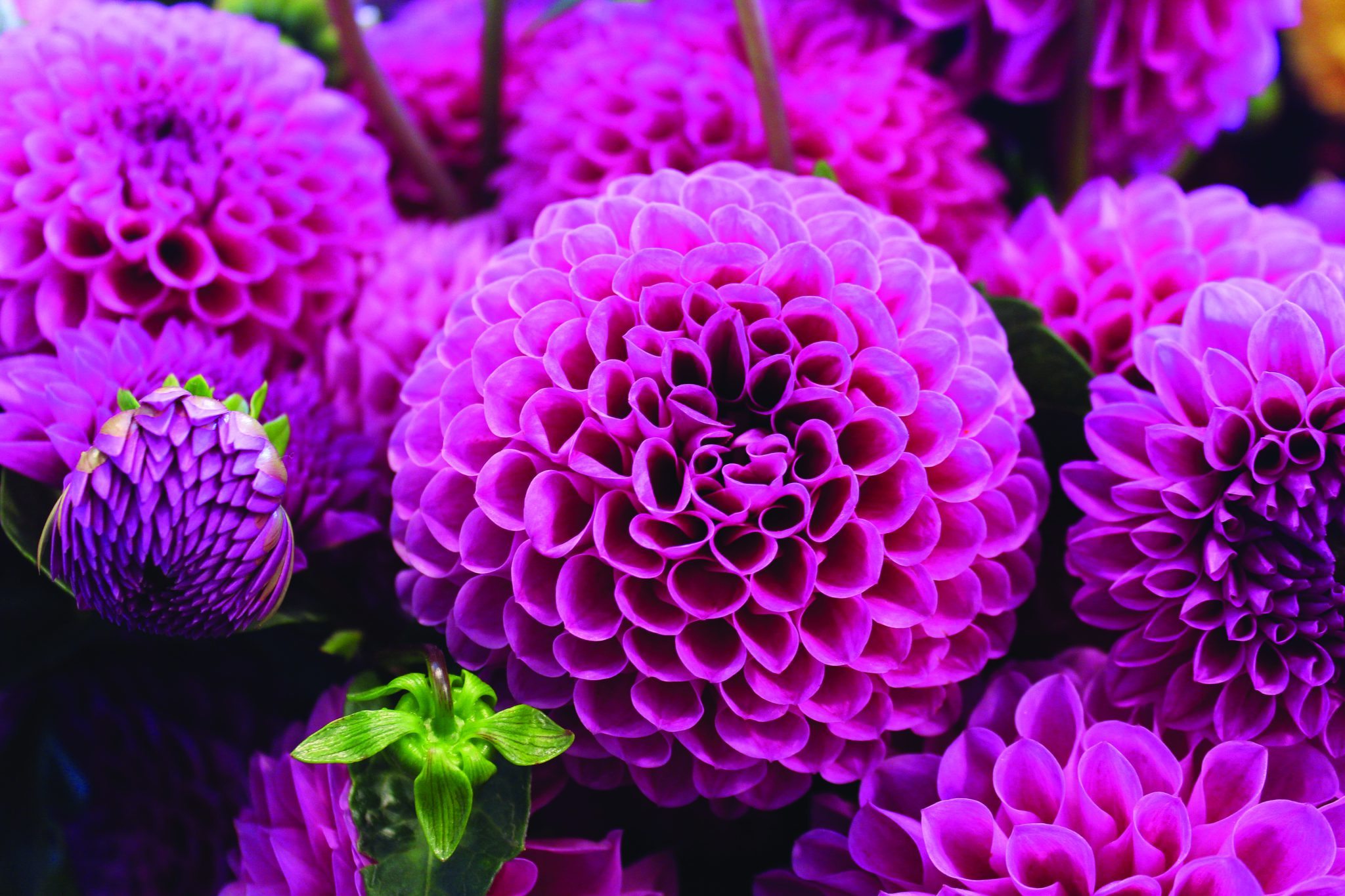
Eiseman says that all colors can make her happy—“depending how and where they are used and what they are combined with,” she says. “However the purple family, particularly to the red side, are especially appealing to me from a creative and psychological standpoint. And I really resonate with a mix of purples and greens. Always bearing in mind that as a professional color consultant, I have to be open to many possibilities—whatever works best for the client’s needs and aspirations.”
Dedicating one’s life to a particular subject, such as color, begs the questions: Can you run out of fresh inspiration in the creative industry? Has everything to say about color been said? Eiseman laughs at these questions and smiles, shaking her head with conviction.
“I have never run out of inspiration, but then there are days when my energy needs a push, and for me, that means I need to commune with the outdoors,” she says. “I’m lucky to live in the northwest area of the U.S. where spring and summer are bursting with floral colors, autumn is ablaze with various hues and in winter there are the varying tones of foliage. There is an incredible light in the area too, and all of this combined provides such great inspiration.”
There are many things that make a big difference in people’s lives, their moods and outlook such as music, scent, taste and touch. But color is undoubtedly one of the more powerful tools for influencing a person’s perception of product, environment or brand. It can literally change the way they see something and affect the decision of whether they want that product in their lives or not. Thus it will always be one of the most powerful tools that the creative industry can utilize.
“I could write a book about how color makes a difference to people’s lives—in fact I’ve written nine of them!” Eiseman says with a laugh. “However in a nutshell, color gets the creative juices going. The use of color allows you to express yourself as an individual, whether it is in your clothing or in your home or garden. From a business standpoint, it is the major area for garnering attention from a would-be consumer, client or customer. Consumers are very savvy today. However, by using colors in retail, whether it be in product, signage or other surroundings/display, or in combination with other colors, it shows that you are cutting-edge and know the newest trend directions.”
To learn more about Lee Eiseman and to see her color blog, visit http://leatriceeiseman.com.
Creative Industry: To learn more about Pantone, visit www.pantone.com.


