by Terri Winter, co-owner and founder of retail store top3 by design in Australia.
Interior design elicits an emotive response. You can feel energized, calm or cocooned in a space based largely on the choice of color.
Color
Using color and texture can affect the emotions of visitors to your store or to your home. Explore the opportunity to create various moods in different areas of your store and encourage customers to do the same in their own homes with these simple color guidelines.
The colors:
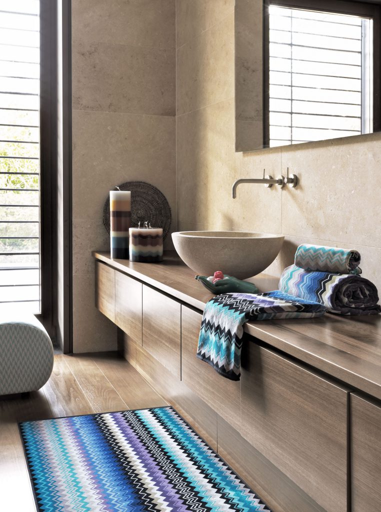
Blue: Calm, fresh and relaxing. Light blues bring an open feeling of the blue skies and oceans. Darker tones can be more rich and cocooning.
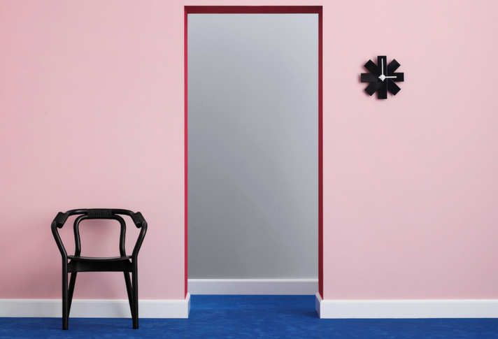
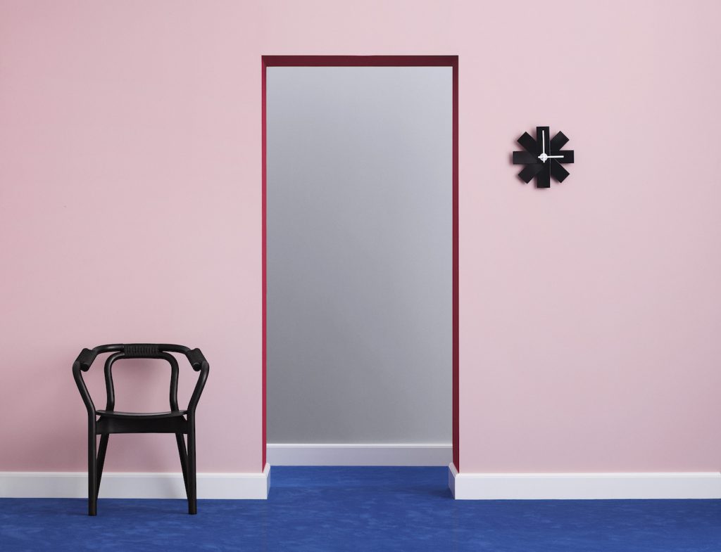
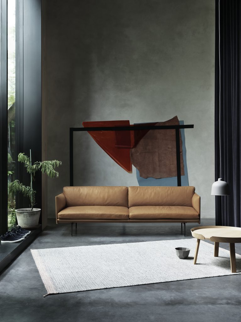
Red: Passion, power and strength. Red raises the pulse and heart rate. Toned-back versions are intimate and work well paired with low lighting romantic. Deep reds can make a space feel intimate and luxurious.
Orange: Energy, vibrancy and innovation. Use sparingly or muted in living spaces to avoid overwhelming the space.
Purple: Spiritual, luxe and creative. Deep tones of purples are decadent.
Yellow: Although it can be sunny and fresh, yellow should be used sparingly and with careful consideration to the tone. A lot of yellow can be stressful and may cause anxiety.
Green: Calming and yet energizing. A great color to use in areas that relate to the outside – for example a living room space providing views of a forest, a lawn area or to an apartment patio with plants. Add real plants rather than actual color in paint or product to be calming and creative.
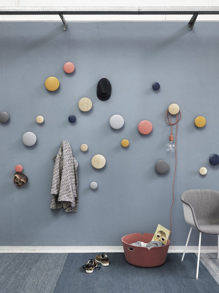
Brown: A great décor color – with natural derivatives, it’s nurturing and is great to evoke conversation, nesting and a feeling of belonging.
The neutrals:
Gray: Gives a sense of relaxation and serenity. Use gray in spaces like home offices or bathrooms.
Black: Bold and graphic. Use black to create structure.
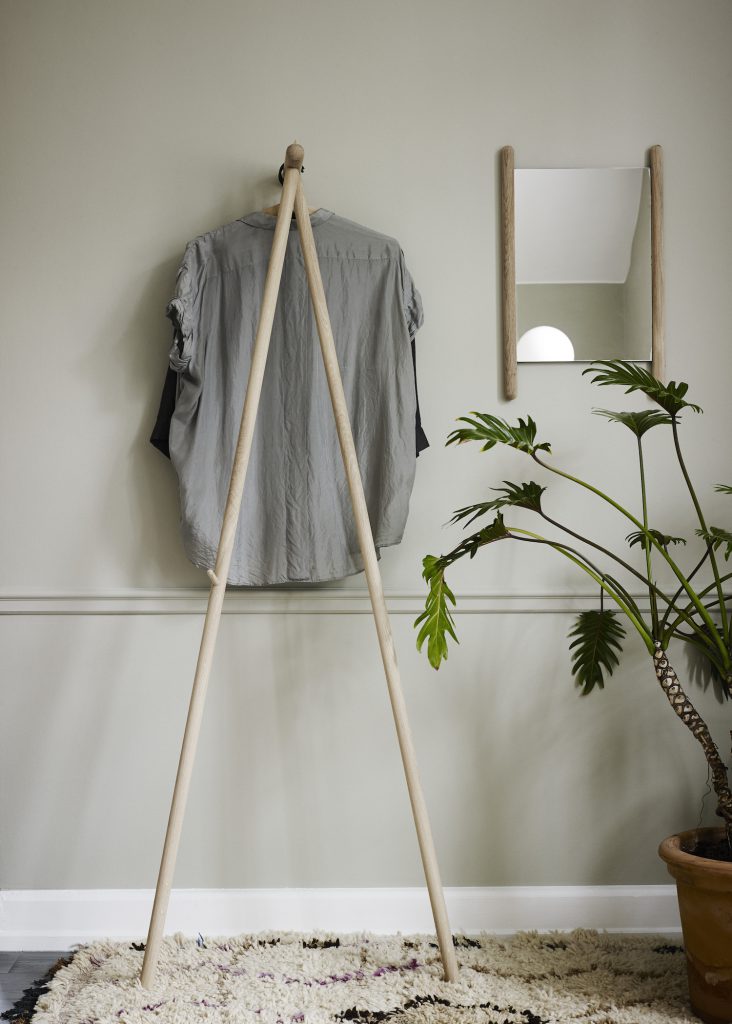
White: White on its own is sterile. There are hundreds of variations of white, and layering various tones gives you a very calm and serene space. Too much use of bright pure white will feel sterile.
As a general rule, no room should ever really be a single color. Even if you are going one color popping against neutrals, go for various tones of your selected color rather than all the same. Create your own blends and you will have a truly emotive space.
But, a single color can be a very deliberate statement choice – which can be a fantastic way to create impact in a small space, for example. A bold choice of a color does make a space memorable. If you blend colors, you can control the emotion and avoid creating a space that is screaming at you when you walk in.
Choose a focus tone, keeping in mind the emotion suitable to the space. Then, accent with colors and complementary tones. If you choose a key color – unless you are preparing a particular emotive, bold statement – then play around with utilizing many tones and variations of your chosen color.
Objects of meaning
Color is not the only way to elicit emotion in a space – your choice of décor objects adds the finishing touches.
Personal objects such as vases with fresh flowers, photo frames or small whimsical objects that nod to your personality create emotive spaces. Books indicate your taste and style – architectural books, cooking books or fashion magazines immediately add your personality to a space.
To learn more about top3 by design, visit www.top3.com.au.