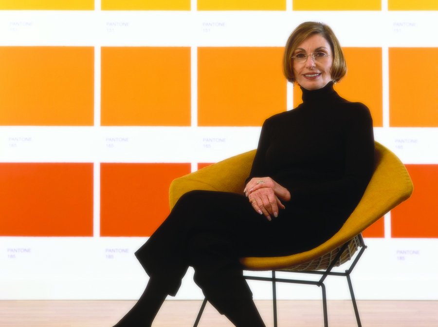
Michelle Hespe chats with Leatrice Eiseman, Pantone Color Institute’s Executive Director, about her view on the cycles of color and how to decide on what is best for your business.
It was once commonly said that fashion, and thus trends and colors, had a 10-year cycle, but in today’s world, that’s really no longer the case. As a global consciousness of the environment and sustainable living continues to spread its wings, a change in what we think of as ‘trends’ has also occurred.
Leatrice Eiseman believes things have slowed down. “People are less in the mood for throwing things away, and what they are looking for is a way to re- combine and bring in a fresher perspective on what they have, possibly enhance it with something new,” she says. “In fact, I can’t think of a color that isn’t ‘in’ right now. The yellow-greens have been popular for many years now and even orange, that at one point was a very trendy color, is continuing on its hot path as it has for many years.”
It’s interesting to think that even color can make its entrance at the wrong time and not be scooped up as lovingly as some would have thought at particular periods in time, while others – like orange – have bounced on to the stage with the bravado of Lady Gaga, and had a lasting effect on the masses. “Historically, there have been ‘color blips,’ as with yellow-greens in the 1980s — there was an attempt to bring it back, but it was too soon to the over-saturated greens of the 70s.”
So the million-dollar question is, is there anything new to discover in the world of color? “I think the newness lies in the combinations and the technology that allows for new finishes and effects on colors,” Eiseman says. “There are no ‘new’ colors, just a different way of using them.”
Leatrice Eiseman and other color experts around the world are in a very influential position when it comes to educating and exciting people about their color choices, which reflect their lifestyle and ultimately have an impact on their lives. And she takes that position very seriously. But is it the experts, picking up on the trends in the air, taking on the waves of popular culture and the effects of everything from politics to personal taste, weather and color, or are they actually creating and influencing the popularity of colors?
“I think it is a bit of both,” Eiseman says. “For example, the orange that was announced as the Color of the Year in 2012 has seen steady growth for many years now, but with it being called the Color of the Year it brought the color to the attention of many who might otherwise not even considered it. Those of us involved in the world of color consulting have the challenge to present the color to the world in an appealing way as a ‘freshening’ device.”
The uptake of a freshened-up color can be uplifting, and sometimes even life changing in difficult times. “Historically, in times of economic distress people have reverted to neutral colors to be on the ‘safe’ and practical side,” Eiseman says. “But today, people are seeing more color and using it more readily. They are not abandoning it but finding clever ways to use it. For example, painting a wall an accent color as opposed to just using a couple of pillows or placemats. They know that paint is one of the least expensive ways to have ‘instant gratification’ and then when they tire of it, they can repaint the wall – again less expensive than replacing the sofa or the carpeting!”
Sharing her knowledge of color is something Leatrice Eiseman does exceptionally well, as anyone who’s been present at her annual International Home + Housewares Show seminars in Chicago will say. And sharing of color knowledge today, does not present some of the many difficulties as it did in the past. These days, with the far reaches of the globe being so inextricably linked due to technology and the ease of travel, most people are taking a more global approach to color, utilizing elements of their heritage and culture to differentiate them when they need or want to.
“It is important to take an international view now,” says Eiseman. “Because when I travel around the world, as I often do, it is now difficult to determine the difference between the way people dress or the appliances they choose for their homes, for example.” She goes on to explain that now, as everyone has access to the web, they are exposed to the way colors are used internationally.
“When I am in Milan looking at store windows, it is difficult to discern the difference between that window and one that I might have just seen in Paris or New York or even Seoul, Korea,” she says.
So when you’re ready to hit the color palettes and decide what is right for your store next year, what advice can the Claus of color give you?
“Find the mood or lifestyle that you think would be most preferred by your target customer,” she says. “We have nine palettes that you can choose from that all revolve around themes. When you find the mood or theme that you think will resonate with your customers (and you know your customers/clients better than anyone), be certain there is a touch of something new in a color that you can display…as color is the key to gaining their attention, and this leads to a sale.”
And that, after all, is the aim of the color game.
To learn more about Pantone and thoughts from Leatrice Eiseman on color trends, see www.pantone.com, www.Eisemancolorblog.com and www.colorexpert.com


