In our highly competitive global marketplace, would-be consumers are continuously being wooed by evocative, imaginative and innovative uses of color and design. Staying on top of the latest color trends and forecasts in a highly visual world is vitally important to selling your products or services.
Introducing the 2016 Pantone View home + interiors color palettes at the International Home + Housewares Show, Leatrice (Lee) Eiseman, executive director of the Pantone Color Institute, said “we now know there is a dichotomy between old world and new, and that they’re often used together at the same time. We know we are going between subtle and shimmering. There can also be a dichotomy of natural and fashionable, often with a touch of whimsy. And occasionally, we are seeing only the whimsy.”
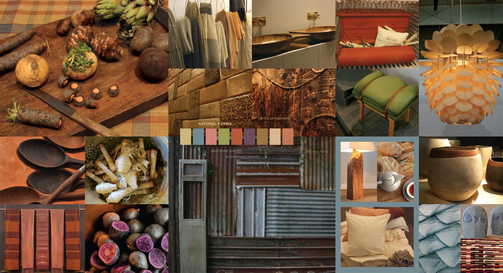
Natural Forms
Nature in its purest forms never ceases to instill a sense of wonder and awe. To surround oneself with organic shapes and shades plumbed from natural sources such as warm rosy clay, burnished rust, sheepskin beige, dense foliage greens, as well as a hearty plum wine tone and a glimmering copper provides a sense of sustenance and reality.
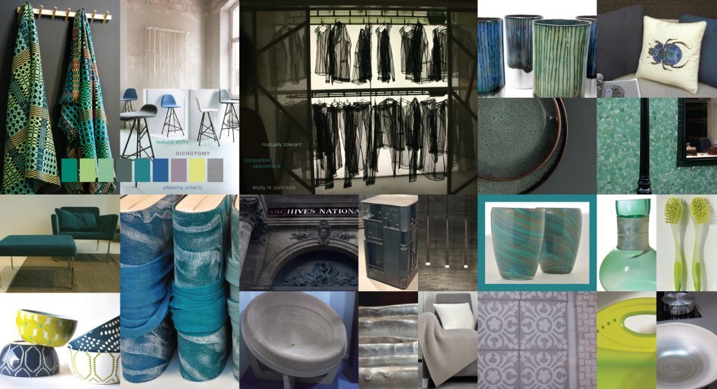
Dichotomy
Dichotomy reinforces the concept that opposites of finish and color do and can attract. Stainless steel contrasts with rock and stone, and smooth surfaces can support nubby or deeply imprinted textures. Subtle weathered green tones remind us of time-worn architecture, while gleaming silver metallic, sparkling, sunny yellow and bright cobalt blue combine in tandem with the more calming slate blues and jade or dark forest green, to create a refreshingly modern day atmosphere.
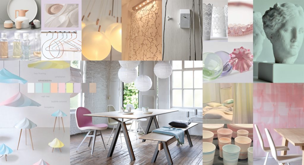
Ephemera
Ephemera expresses a lightness of color that is often described as pastel. Colors such as Wan Blue, Pale Peach, Pink Dogwood, Tender Yellow, Orchid Ice, Frosted Almond and a clarifying white called “Cloud Dancer” more than aptly describe these disarmingly charming tints.
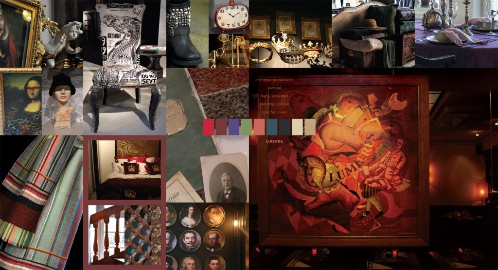
Lineage
In Lineage, the “heritage” look takes an unconventional adaption and a sense of whimsy and more au courant touch overrides a serious attitude. This is a palette where shades of navy, black, tan and a regimental green can co-mingle with stirring touches of Mars Red, Gentian Violet and Apricot Brandy, and slightly tarnished tones stand proudly next to a glimmering Champagne Beige.
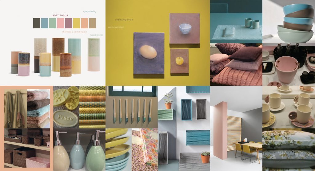
Soft Focus
In a place between pastels and mid-tones reside the colors that bridge the two. These subtle and/or muted shades are sometimes described as “smoky” and pleasingly versatile. The palette called “Soft Focus” includes a nostalgic rose tone, a delicious Peach Nougat, a warm tan and a blue Tourmaline. For a surprising bit of sparkle, a creamy gold tops off the palette.
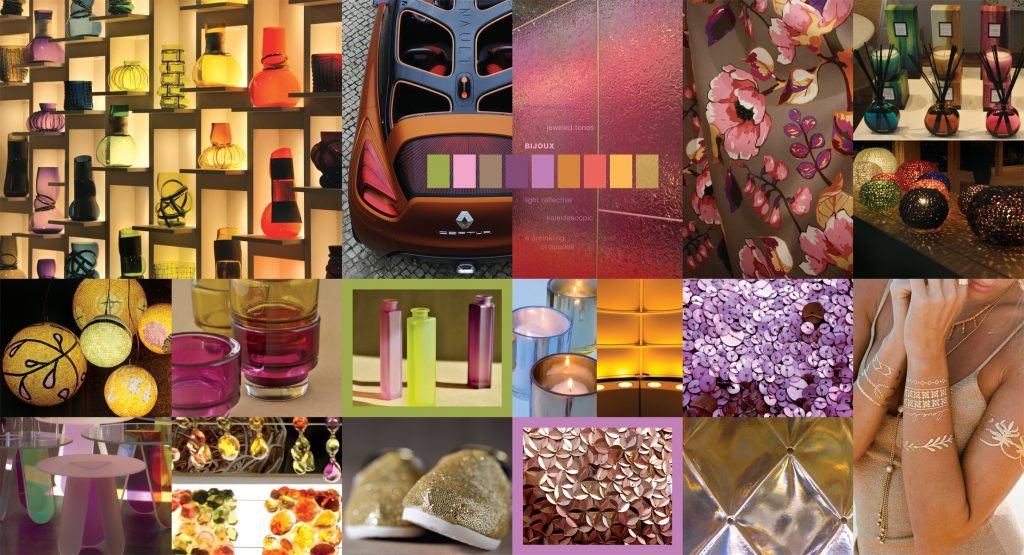
Bijoux
In the French language, Bijoux literally means “jewelry.” A fitting title, as this is the palette that gleams with drama and intensity. Jewel tones such as Prism Pink, Amethyst, Topaz and Amber Yellow are artfully reflected or mirrored when juxtaposed next to equally striking tones of Violet, Dark Citron, Ember Glow, Rich Gold and a taupe that is one of the complex colors found within a tiger’s eye.
Merriment
This lively palette is where color trends and design truly come out to play. The joyful “up” shades of the vibrant Classic Green and Mimosa Yellow seem even happier and more unique when they are mixed or contrasted with Super Pink, Cantaloupe and Orangeade as well as some down to earth neutrals like Sesame and Ginger Snap. A vivid turquoise, called Aquarius (as in “the age of”), brings a note of retro influence into play.

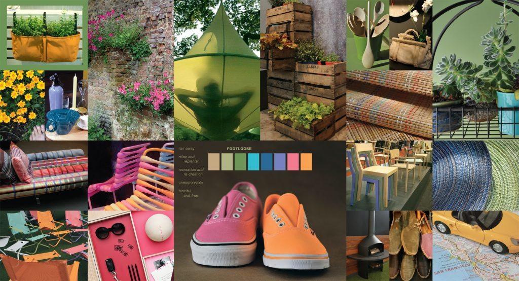
Footloose
The palette called Footloose is just that – expressing the need to throw off the constricting scheduling of everyday lives and simply enjoy the freedom of the outdoors. Colors make for capricious combinations like Winter Pear and Strawberry Pink, Blazing Orange, Deep Periwinkle and Meadow Green, in addition to vacation-destination blues and blue-greens with tempting names like Capri and Vallarta Blue.
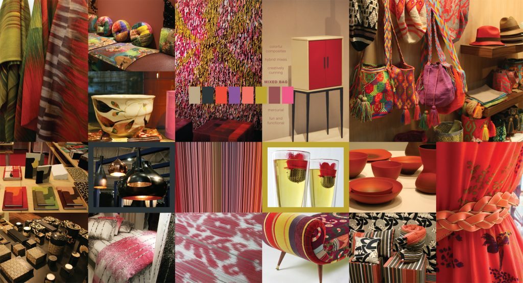
Mixed Bag
A “mixed bag” is just that – an assortment of eclectic patterns and prints that are drawn primarily from diverse cultures and a multi-national influence. Some are familiar, but no less exciting, like Pirate Black and Mandarin Red and others are more unique, demanding a second look. Violet and florid orange hues are quieted somewhat by a sugary ginger shade, while a sultry hot pink and robust wine tone are intriguingly complemented by a plush, mossy yellow-green.
The audio recording of the presentation is available at http://www.housewares.org/kc/ed/15.aspx
Extracted with permission from PANTONE®VIEW home + interiors 2016 color trends forecast.
At the 2016 Show, color trends and material trends for 2016/2017 will be revealed at the color seminars by Pantone. Visit also the Pantone ColorWatch display to view, first-hand, detailed forecasts and trend identification.
To learn more about Pantone, see www.pantone.com.